
Building a Design system
HILTON WORLDWIDE • INTERNAL SYSTEM FOR MOBILE APPLICATIONS

The Task
To help build an internal design system with re-usable components for the Android & IOS apps that contains synchrony between the below two parts:
Figma design library
Utilized by the design team to build and create views and/or screens.
Accompanied by component guidelines, which guides team members how and why to use each component.
Developer catalog
Allows developers to build and release vetted components already built by the platform design team, and already coded by the platform developers.
Goals
Productive feedback loops
Seamless communication between design and developers
Real time testing to make design decisions
Limiting “hand-offs” and creating a more fluid communication cycle between tracks
Speed
Designs are created and released quicker than ever before
Quick turnover allows for more A/B testing
Parity between Android & IOS applications
Flexible design within our boundaries; creating a clean, consistent, Hilton branded look and feel
Role
As the lead UX designer on this project, I would be in charge of creating the component wireframes and writing the usage guidelines. I worked with one other dedicated UX designer, as well as the research, content, accessibility and UI teams.
Process
Tactics that helped the library come to life:
Weekly XD (UX, UI, Research, Accessibility, Content) brainstorming sessions so that all components could be created collaboratively
Over-communicating with the developers to validate and brainstorm possibilities, native component baselines, naming conventions and guidelines
Creating time for solo “focused working periods” to complete on guideline writing
Weekly content component reviews with UX and content teams to review and edit guidelines (review 5 components per week)
Robust emoji labeling systems and utilizing figma comments on each component page to demonstrate progress and who is working on what
The Library
Component Features

Pictured: A side by side of the button component in the design library and the IOS developer catalog.
One internal language
The design library and the developer catalogs are 1:1 in name and design
Atomic design influence
Teams can create views and/or screens using “building blocks”- atoms, to molecules, to organisms
Flexibility with different properties and variants, allowing for
The ability to use different atoms and molecules within organisms
Release in multiple languages
Consistent dimensions, grids, icons, typography, etc. Android/IOS
Some properties are:
Android/IOS
Light/Dark mode
Right-to-left/Left-to-right
(and more…)
Vetted components
To be user-friendly and accessible
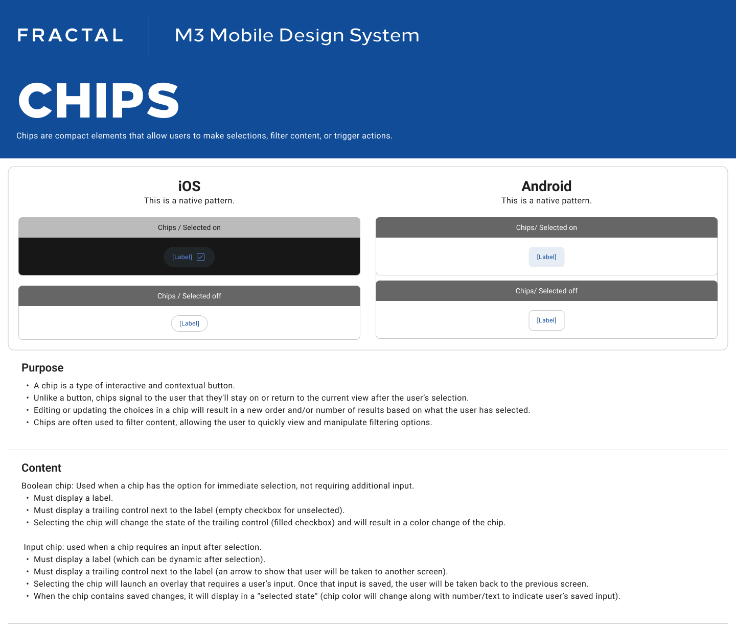
Component Library Guidelines
Component guidelines are provided in Figma, helping the design team make decisions around usage. Each component contains information on:
Types
Purpose
Content
Context & placement
Do’s & Don'ts
Accessibility rules
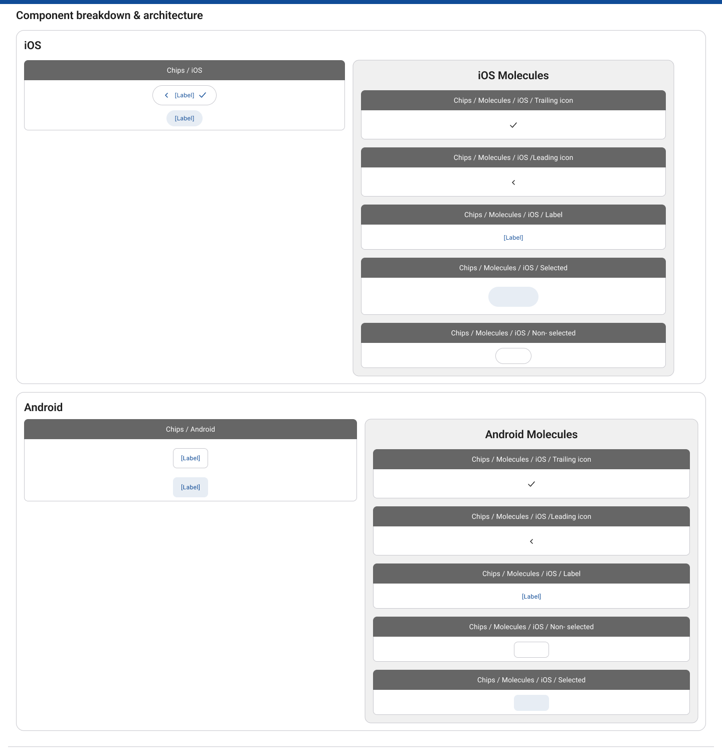
Component breakdown & architecture
Related components
Below is an example of our Chips component guidelines in Figma.


How It’s Being Used Today
Our figma design library allows those using it to drag and drop components into views and edit their properties and the content (imagery, text, icons, labels, etc.).
Component labels are usually provided when views of components are shared in figma, however, they aren’t necessarily required (as all of our components are labeled as they would be in our dev catalogs).
Our library is ever-evolving, as there will always be room for growth.
Example of Android and IOS view using our component library:
