
Searching for a hotel
Hilton WORLDWIDE • flow re-design FOR MOBILE APPS

The problem
In 2019, the Hilton Honors Android & IOS apps experienced a decrease in users who converted from the hotel search to the booking funnel.
Problems discovered through qualitative & quantitative data
Users were not easily provided with the information they needed in order to confidently select a hotel
Users were having trouble navigating to certain elements like filtering & viewing the map
Hotel amenity icons did not translate well
The Solution
To redesign the Hilton Honors IOS & Android apps’ entire search flow to
Optimize the app experience
Provide the user with the information they need in order confidently select a hotel
Increase app conversion
My role
As the lead UX architect, I was in charge of identifying problems and to deliver a new, updated flow in within the technical constraints. For now, this meant cleaning up the existing flow to make it more intuitive, without adding any new features. I worked with a UI designer, a copy writer, a product owner, and our dev / QA team.
Process
Step 1: define the problem
Walk through the current experience with our users to problem-spot and identify areas of opportunity
Gather statistical data the existing flow’s usage to understand potential gaps
Step 2: DESIGN A NEW EXPERIENCE
Brainstorm & design different options
User testing rounds with varied flow options to validate & iterate
Step 3: Release & Learn
Release updated designs in the app with different variables (A/B testing) to learn which designs convert better
Defining the problem
What did users have to say about the previous search experience?
Task
A sample of Hilton users were asked to walk through the app and talk about their experience.
Objective
Discover current gaps and identify areas of opportunity.
Results

Pictured: a preview of the previous search entries
Too many steps make the experience cumbersome
Text is difficult to read with low color contrast
Search default’s are not helpful for most users (this was validated through qualitative research as well)
When searching for a location, users request auto- suggest

Pictured: a preview of the previous search results
Users request the ability to edit search entries directly from the search results
Icons representing amenities on the hotel cards are not easily understood
Users want to see hotel details without committing to picking a room
Text on the hotel cards is difficult to read with low color contrast
Map and list icons are not easily understood
The new Experience
Simplifying the search flow
getting there through testing
Two flows were tested to understand the preferred
With and without Search review screen
Search results screen
Search results screen - touchpoint expectations
After testing different flows, we learned that users preferred to be taken directly into the required steps, with the ability to review and add any supplemental information that applied to their search. Changes were made to provide the user with a balance of speed and simplicity.
- Before -

- AFTER -

Wireframes

Screen breakdown
Location SEARCH

Added recent searches
Added auto suggest
Added icons to represent different search categories (ie: hotel, city, airport)
Date Selection

Added highlighted state to check-in and check-out
Added dynamic call-to-action displaying number of nights
Search Review

Users want to review their search items before they apply their search
Allows them to add any supplemental information
Bottom sheet feels quick & un-intrusive
Search Results

Chips allow users to edit search items directly from the results
Hotel information is easily accessible without committing to pick a room
Added “Search with points” toggle to allow users to compare points vs. price
Map & filter are easily accessible
Search Results - Map
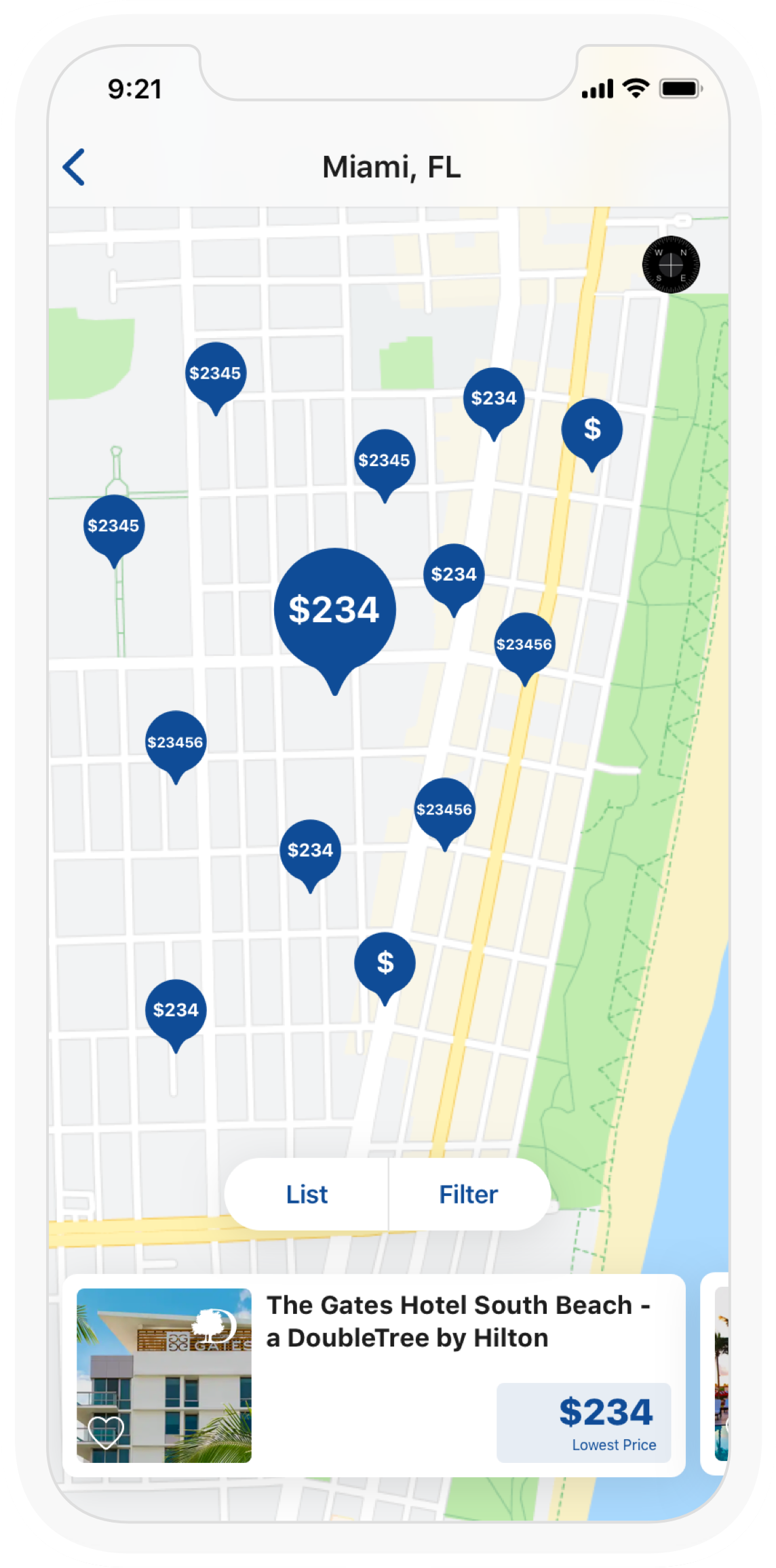
Pins are now consistent in shape and color
Swipe-able cards allow for searching without having to select a pin
Pins now display prices as testing revealed price as a high priority for hotel selection
Hotel Details

Amenities are now accompanied with text and at the top, as testing revealed they were a high priority for hotel selection
Hotel details are now separated from room selection so users can review details while still in the search phase, as requested
Release & Learn
Next Steps
In 2020, multiple variations of these screens will be released to determine which options lead to more bookings. Based on those results, iterations will be taken into consideration.
Now that the design has been cleaned up, our objective is to learn and enhance, using requested new features.
Considerations
The wireframes and comps displayed demonstrate the happy path, and are for a single room booking.
Edge cases, error states, and multi-room bookings were also a part of our learning and design process.
iOS wireframes and comps are displayed, but Android comps were designed cohesively, using the same flows with some subtle UI differences to follow the material guidelines.